Mermaid diagrams describe visuals using text.
Instead of drawing boxes and arrows manually, you write structured instructions that define how a diagram should look. A flowchart, a sequence, or a chart exists as readable code. When rendered, that code turns into a visual diagram.
This approach changes how diagrams fit into real work.
Mermaid diagrams live inside documentation, code repositories, wikis, and blogs. They move with the content instead of sitting as static images. When logic changes, the diagram changes with it.
On this page
That is why developers adopted Mermaid diagrams early. Over time, product teams, analysts, writers, and educators followed. The format works anywhere Markdown works. GitHub, Notion, internal docs, and technical blogs all render Mermaid diagrams cleanly.
The diagram stays transparent. Anyone can read the structure. Anyone can edit it. Nothing hides behind a canvas or proprietary file.
Mermaid diagrams solve a practical problem. They keep visuals editable, versioned, and close to the ideas they explain.
Why AI-Powered Mermaid Diagrams Are Getting Popular?
Mermaid diagrams always required some familiarity with syntax. That learning curve kept many people away.
AI removes that barrier.
Today, people explain a process in plain language and receive correct Mermaid diagram code in return. The AI understands structure, relationships, and diagram rules. It produces usable output immediately.
This shift explains the recent growth in Mermaid diagrams.
Teams now treat diagrams as part of thinking, not a finishing step. Product flows, approval processes, and system interactions appear visually while ideas still form.
AI also changes iteration speed. You do not redraw diagrams. You refine them. You adjust labels. You add conditions. The Mermaid diagrams update through conversation.
Another reason for adoption lies in consistency. AI generates diagrams that follow Mermaid standards. That consistency reduces errors and keeps documentation readable across teams.
Mermaid diagrams also benefit from portability. AI-generated code works in multiple editors and environments. The same diagram renders in documentation, blogs, and internal tools without rework.
In short, AI makes Mermaid diagrams accessible to people who think visually but prefer writing over drawing.
How to Create Charts using Mermaid?
Charts usually come first when people explore Mermaid diagrams. They feel familiar and practical. AI helps bridge the gap between raw data and structured visuals.
Mermaid diagrams support several chart types. Each type serves a different purpose, yet the workflow stays consistent. You describe the data. AI generates the diagram code. You refine as needed.
The sections below walk through chart and diagram types in a natural progression, starting with simple data visuals and moving toward structural diagrams.
Pie Charts Using Mermaid Diagrams
Pie charts show proportion. They answer questions about distribution rather than growth or comparison.
Mermaid diagrams represent pie charts with explicit values. Each slice appears clearly in the code, which makes updates straightforward when numbers change.
AI improves this process by converting plain descriptions into correctly structured Mermaid diagrams. You focus on the meaning of the data instead of formatting.
Pie charts work well for budgets, survey results, allocations, and preference splits.
AI Prompt: Basic Pie Chart
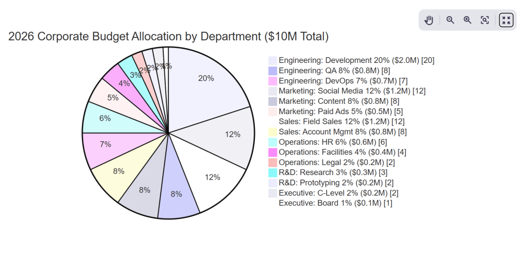
“Create a detailed colorful mermaid pie chart diagram for the company departmental budget allocation 2026 with nested categories, precise percentages, professional styling and data annotations.
Budget Breakdown:
- Engineering Department 35% [Development 20%, QA 8%, DevOps 7%]
- Marketing Department 25% [Social Media 12%, Content 8%, Paid Ads 5%]
- Sales Department 20% [Field Sales 12%, Account Management 8%]
- Operations 12% [HR 6%, Facilities 4%, Legal 2%]
- R&D 5% [Research 3%, Prototyping 2%]
- Executive 3% [C-Level 2%, Board 1%]
Requirements:
- Main title ‘2026 Corporate Budget Allocation by Department ($10M Total)’
- Show both department percentages AND nested sub-categories as exploded slices
- Color scheme: Engineering=deep blue, Marketing=teal, Sales=green, Operations=purple, R&D=orange, Executive=gold
- Data labels showing both % and $ amounts (calculate from $10M total)
- Explode 3 largest slices (Engineering, Marketing, Sales) by 10% outward
- Include inner ring showing sub-category breakdown
- Legend positioned bottom-right with department names and color codes
- Add a subtle 3D effect with shadows on slices
- Value range display: show exact $ values like ‘$3.5M’, ‘$2.5M’, etc.
- Professional gradient fills matching corporate color palette
- Grid background with subtle department division lines
- Donut hole center with total budget ‘$10M FY2026’ in bold white text”
Bar Charts Using Mermaid Diagrams
Bar charts serve different analytical needs.
Bar charts compare values across categories. Line charts show movement over time. Mermaid diagrams handle both through structured datasets.
AI-generated Mermaid diagrams keep the data readable even before rendering. That transparency helps when charts appear inside documentation or reports.
These charts often appear in performance tracking, analytics summaries, and operational reporting.
AI Prompt: Bar Chart
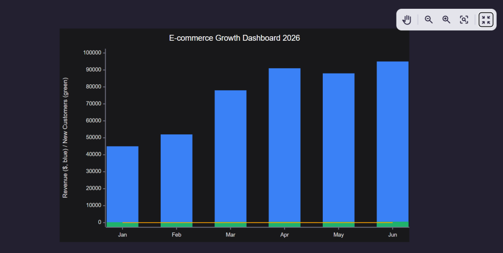
“Create a mermaid xychart-beta bar diagram for the e-commerce KPI dashboard showing multiple metrics across 6 months.
Data:
- Months: Jan, Feb, Mar, Apr, May, Jun
- Revenue: [$45k, $52k, $78k, $91k, $88k, $95k]
- New Customers: [245, 312, 456, 523, 498, 567]
- Conversion Rate: [2.8%, 3.1%, 4.2%, 4.8%, 4.5%, 4.9%]
Requirements:
- Title ‘E-commerce Growth Dashboard 2026’
- Primary y-axis Revenue $0-$100k (left)
- Secondary y-axis Customers & Conversion % (right, 0-600 customers, 0-6%)
- Three bar series: Revenue (blue), New Customers (green), Conversion (orange line overlay)
- X-axis month labels with clean spacing
- Professional styling with grid lines, data labels on bars, and legend
- Dark theme compatible”
Line Charts Using Mermaid Diagrams
Line charts serve a different analytical purpose.
They track movement across time, showing trends, momentum shifts, and direction rather than category-by-category comparison. In Mermaid diagrams, line charts emerge directly from ordered datasets, where time or sequence stays explicit in the code itself.
AI-generated Mermaid diagrams keep that structure readable before rendering, which makes trend logic easy to audit inside documents or reports. These charts commonly appear in growth tracking, time-series analysis, system monitoring, and long-range performance reviews.
These diagrams appear frequently in process documentation, system design, and product workflows.
AI Prompt: Line Chart Diagram
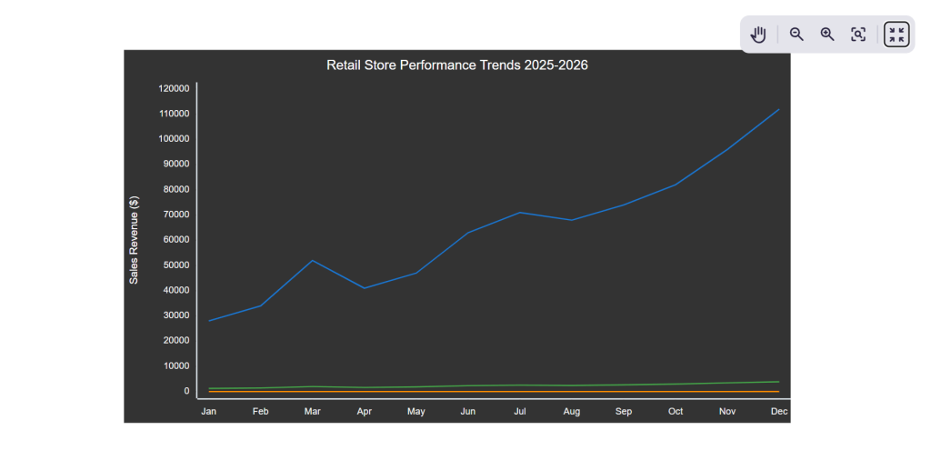
“Create a detailed mermaid xychart-beta line chart for retail store foot traffic and sales trends across 12 months with multiple data series and professional formatting.
Data:
- Months: Jan, Feb, Mar, Apr, May, Jun, Jul, Aug, Sep, Oct, Nov, Dec
- Foot Traffic: [1250, 1420, 1980, 1650, 1870, 2340, 2560, 2430, 2670, 2980, 3450, 3890]
- Sales Revenue: [$28k, $34k, $52k, $41k, $47k, $63k, $71k, $68k, $74k, $82k, $96k, $112k]
- Avg Transaction Value: [$22.40, $23.90, $26.30, $24.80, $25.10, $26.90, $27.70, $28.00, $27.70, $27.50, $27.80, $28.80]
Requirements:
- Title ‘Retail Store Performance Trends 2025-2026’
- X-axis: Month labels (Jan-Dec) with subtle rotation if needed
- Primary Y-axis (left): Revenue $0-$120k, label ‘Sales Revenue’
- Secondary Y-axis (right): Foot Traffic 0-4000, label ‘Visitors’
- Insert line series:
- Thick blue line for Sales Revenue with filled circles at data points
- Dashed green line for Foot Traffic with square markers
- Thin orange line for Avg Transaction Value overlay (0-35 range)
- Add horizontal grid lines every $20k revenue
- Show data value labels on key peaks (Mar, Jul, Nov, Dec)
- Legend positioned top-right with series names
- Smooth line interpolation where possible
- Professional gradient background, clean fonts”
Advanced Diagrams Using Mermaid Diagrams and AI
Once people feel comfortable creating charts and simple flows, they usually move toward diagrams that explain structure and planning. This is where Mermaid diagrams start showing real depth.
Advanced diagrams help explain systems, relationships, timelines, and ideas that do not fit neatly into tables or charts. AI makes these diagrams approachable by converting descriptive language into structured Mermaid code.
Instead of starting with diagram rules, you start with intent. You explain how things connect, branch, or progress. The AI handles the syntax and structure behind the scenes.
These advanced Mermaid diagrams often appear in technical documentation, product planning, architecture overviews, and strategy discussions.
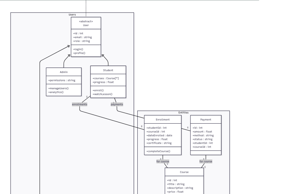
Class Diagrams Using Mermaid Diagrams
Class diagrams explain structure. They show how entities relate to one another, what attributes they hold, and how responsibilities connect.
Mermaid diagrams represent class diagrams clearly because the relationships remain explicit in text form. AI helps translate conceptual descriptions into properly linked classes without manual effort.
These diagrams work well for system design, data models, and object relationships.
AI Prompt: Class Diagram
“Create a detailed mermaid class diagram for a complete Online Learning Platform with inheritance, associations, composition, and annotations.
Classes:
- User (Abstract): id, email, role | login(), profile()
- Student extends User: courses[], progress | enroll(), watchLesson()
- Instructor extends User: coursesTaught[], bio | createCourse(), grade()
- Admin extends User: permissions | manageUsers(), analytics()
- Course: id, title, description, price, duration, students[], lessons[], instructor
- Lesson: id, title, videoUrl, duration, quizzes[], position
- Quiz: id, questions[], timeLimit | submit(), score()
- Enrollment: studentId, courseId, dateEnrolled, progress, certificate | completeCourse()
- Payment: id, amount, method, status, studentId, courseId
Relationships:
- Student 1—* Enrollment
- Enrollment *—1 Course
- Course 1—* Lesson
- Course 1—1 Instructor
- Lesson 1—* Quiz
- Student 1—* Payment
- Payment *—1 Course
Requirements:
- Title ‘Online Learning Platform – Complete Class Diagram’
- UML notation with multiplicity (1,*,1..*)
- Inheritance arrows with triangles
- Composition diamonds for Course-Lessons
- Methods: +public -private
- Color: User=blue, Course=green, Lesson=orange, Quiz=red
- Package groups: <<Entities>> <<Users>> <<Academic>>
- Legend with UML symbols
- Professional styling, shadows, gradients”
Mindmaps Using Mermaid Diagrams
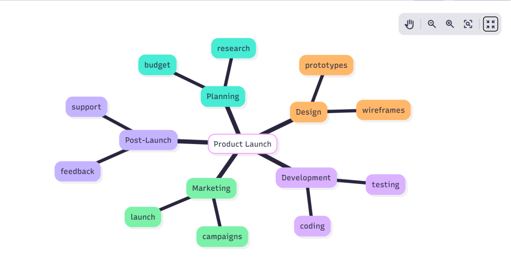
Mindmaps help organize ideas rather than explain logic. They capture thoughts, branches, and associations.
Mermaid diagrams treat mindmaps as hierarchical structures. AI helps generate these structures naturally from brainstorming-style descriptions.
This works well for planning, content outlines, product ideas, and research mapping.
AI Prompt: Mindmap
“Create a comprehensive colorful mermaid mindmap for Digital Marketing Strategy 2026 with multiple levels, detailed branches, icons, and professional styling.
Central Node: ‘Digital Marketing Strategy 2026’
Level 1 Branches:
- Content Marketing (Green)
- Blog Posts (12/month, SEO optimized)
- Video Content (YouTube, Shorts, Reels)
- Email Newsletters (Weekly, 25k subs)
- Lead Magnets (Ebooks, Templates, Webinars)
- Social Media (Blue)
- Platform Strategy (LinkedIn B2B, Instagram B2C)
- Content Calendar (3 posts/week/platform)
- Employee Advocacy (50 champions)
- Paid Social (LinkedIn $5k/mo, Instagram $3k/mo)
- Paid Advertising (Red)
- Google Ads (Search $10k, Display $5k)
- LinkedIn Ads (Lead Gen $8k)
- Retargeting (All platforms)
- A/B Testing (3 variants/campaign)
- SEO & Technical (Purple)
- Keyword Research (Primary 20, Secondary 100)
- Technical Audit (Core Web Vitals)
- Backlink Building (50/mo DA30+)
- Content Optimization (AI tools)
- Analytics & Optimization (Orange)
- KPI Dashboard (GA4, Looker Studio)
- Monthly Reporting (C-suite format)
- CRO Testing (5 tests/quarter)
- Attribution Modeling (Data-driven)
Requirements:
- Title ‘Digital Marketing Strategy 2026 – Complete Roadmap’
- Central node large circle with gradient gold/blue
- Level 1: Thick curved branches with icons (📝💻📧🎥📱💰🔍📊)
- Level 2: Thinner branches with metrics/numbers visible
- Color code each main branch consistently
- Add progress indicators: 75% complete (Content), 50% (Social), etc.
- Professional shadows, glow effects on central node
- Legend bottom-right explaining colors and status indicators
- Radial layout maximizing space utilization
- Clean corporate typography with bold metrics
Gantt Charts Using Mermaid Diagrams
Gantt charts visualize time and dependency. They explain how tasks progress and overlap.
Mermaid diagrams handle Gantt charts using structured timelines. AI helps convert simple task descriptions into timelines with start dates, durations, and dependencies.
These diagrams work well for project planning, execution tracking, and roadmap communication.
AI Prompt: Gantt Chart
“Create a colorful detailed mermaid Gantt chart for a complete website redesign project with multiple teams, milestones, dependencies, and progress indicators across 3 months.
Project Details:
- dateFormat YYYY-MM-DD
- todayMarker 2026-04-15
- axisFormat %d/%m
- Sections & Tasks:
- section Planning (Blue)
- Project Kickoff :kickoff, 2026-03-01, 2026-03-05
- Research & Discovery :research, after kickoff, 10d
- Wireframes Complete :wireframes, after research, 2026-03-20
- section Design (Green)
- UI/UX Design :design, after wireframes, 15d
- Design Review :review1, after design, 3d
- Final Assets :assets, after review1, 2026-03-31
- section Development (Orange)
- Frontend Build :frontend, after assets, 20d
- Backend Integration :backend, after frontend, 18d
- API Development :api, 2026-04-10, 12d
- section Testing (Purple)
- QA Testing :qa, after backend, 10d
- User Acceptance :uat, after qa, 7d
- Bug Fixes :bugs, after uat, 5d
- section Launch (Red)
- Staging Deploy :staging, after bugs, 3d
- Production Launch :launch, after staging, 2026-04-28
- Post-Launch Support :support, after launch, 14d
- Milestones:
- Milestone Design Done :milestone1, 2026-03-31, 0d
- Milestone Dev Complete :milestone2, 2026-04-15, 0d
- Milestone Go-Live :milestone3, 2026-04-28, 0d
- Requirements:
- Title ‘Website Redesign Project Timeline – Q2 2026’
- Color code sections: Planning=blue, Design=green, Dev=orange, Testing=purple, Launch=red
- Critical path highlighting on frontend/backend/launch tasks
- Today marker stroke width 3px red dashed line
- Progress bars: 100% complete (kickoff, research), 75% (design), 50% (frontend), 25% (others)
- Milestones as diamond shapes in gold
- Vertical grid lines weekly, horizontal section separators
- Task labels show exact dates on hover
- Professional project management styling with shadows
- Legend showing color coding and progress indicators”
- section Planning (Blue)
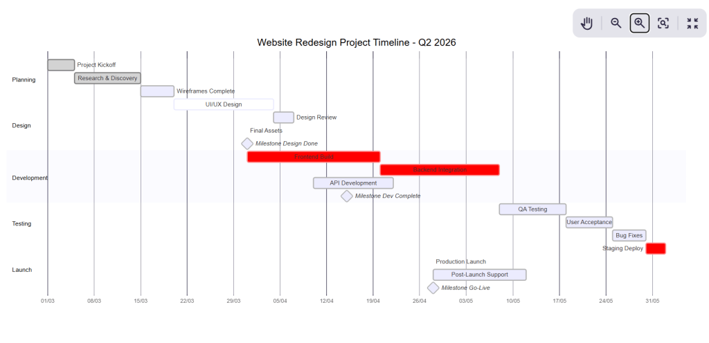
Once generated, Mermaid diagrams allow quick updates. Changing a date or duration immediately reflects in the visual output.
Sankey Diagrams Using Mermaid Diagrams
Sankey diagrams explain flow and distribution. They show how quantities move between stages or categories.
Mermaid diagrams represent Sankey flows through defined connections. AI helps structure these flows based on descriptive input.
These diagrams work well for budget flows, resource allocation, and process distribution analysis.
AI Prompt: Sankey Diagram
“Create a detailed mermaid sankey-beta diagram for complete marketing budget allocation flow showing multiple stages and realistic business data.
Data flow:
Total Marketing Budget $500k flows to:
- Social Media Ads $200k → Facebook $120k, Instagram $60k, LinkedIn $20k
- Google Ads $120k → Search $80k, Display $25k, YouTube $15k
- Content Marketing $80k → Blog $40k, Video $25k, Infographics $15k
- Events & Partnerships $60k → Trade Shows $35k, Webinars $15k, Sponsorships $10k
- Tools & Software $40k → Analytics $20k, Automation $15k, Design $5k
Requirements:
- Title ‘Marketing Budget Allocation Flow 2026’
- Source node ‘Total Budget $500k’ at top
- Clean horizontal layout with professional node styling
- Flow magnitudes proportional to dollar values
- Show exact $ amounts on each link
- Color code by channel: Social (blue), Google (green), Content (orange), Events (purple), Tools (gray)
- Add subtle glow effects on main flows
- Legend explaining color categories
- Grid background, professional fonts
- Ensure all $500k flows through to final categories without gaps”
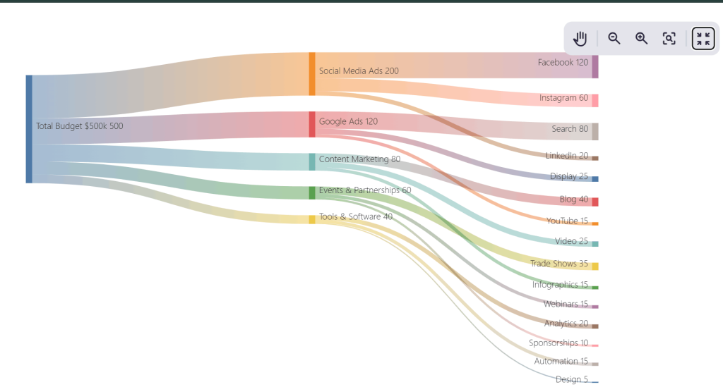
Sankey diagrams often look complex at first glance. AI-generated Mermaid diagrams simplify this by maintaining clarity and balance in the underlying structure.
Phew, a long list of mermaid diagrams that you can create using Mermaid! What makes mermaid my favorite is the versatility. There are a lot of different mermaid diagrams that you can create within seconds.
The only thing that needs proper attention while creating mermaid diagrams using AI is the prompts themselves. You need accurate prompts to create accurate diagrams. Now the question is, is there any way to speed-up the entire process? Well, there is!
Let me explain this to you next.
How I Fasten the Entire Mermaid Diagram Process With AI?
Speed is very important for Mermaid diagrams. You cannot keep working on writing multiple prompts. It can significantly slow down your entire process. Writing detailed, precise prompts again and again eats time and mental energy. That is the bottleneck I focused on removing. So I decided to go with AI to create prompts within minutes.
I tested multiple tools for this stage. While ChatGPT worked for general ideation, it struggled with consistency when prompts became long, layered, or constraint-heavy. For Mermaid diagrams, that inconsistency results into syntax drift, missed requirements, or extra cleanup work.
So I decided to switch to Perplexity AI for prompt creation. Reason? It performs better on structure-heavy tasks. It keeps requirements intact, respects formatting instructions, and handles long lists without collapsing them into vague summaries. That single difference cuts revision time sharply.
The goal is simple. I use Perplexity to generate strong, reusable prompts, then feed those prompts into Mermaid-compatible environments to generate diagrams quickly.
After setting this up, the workflow becomes repeatable and fast.
Here is how I do it in practice:
- I describe the diagram intent in plain language first, including purpose, audience, and where the diagram will appear
- I list all constraints upfront, such as chart type, labels, layout style, rendering environment, and formatting rules
- I ask Perplexity to generate a reusable AI prompt instead of diagram code
- I review the prompt once and tighten wording where needed, focusing on clarity and completeness
- I reuse the same prompt across datasets, scenarios, or projects without rewriting
- I paste the refined prompt into Mermaid-friendly editors or tools to generate charts or diagrams
- I iterate by editing the prompt, not the diagram, when changes are required
This process shifts effort away from syntax management and into clear thinking. Perplexity handles structure reliably, which matters more than creativity at this stage. Mermaid diagrams then act as the execution layer, turning clean prompts into editable visuals.
The best part? You get consistent results. You can quickly upgrade your diagrams. You can also cut down your turnaround time as you don’t have to waste time on redrawing or debugging. Once this loop is in place, Mermaid diagrams stop feeling like a separate task and start behaving like a natural extension of writing and planning.
Wrapping Up
Mermaid diagrams work because they keep visuals close to thinking. They stay editable, readable, and embedded inside the same content where ideas live. If you need to make some changes, you can easily alter the diagrams.
And if you are using AI, you eliminate the risk of syntax friction. You can create clear prompts and turn it directly into Mermaid diagrams. That’s the reason why the result stays fast, flexible, and easy to refine.
Once this workflow is in place, diagrams stop feeling like extra work. They become a natural part of writing, planning, and explaining ideas.
I hope you will be able to create mermaid diagrams superfast using this guide. I have also added specific prompts for each diagram. This might help you learn and enhance your diagram generation process.
If you liked this blog, feel free to explore our website. You will find a lot of interesting stuff on technology, business, IT and more. Till then, goodbye!
FAQs
What are Mermaid diagrams used for?
Mermaid diagrams help explain processes, structures, timelines, and data using text-based instructions that render as visuals.
Where do Mermaid diagrams work best?
They work inside Markdown environments like documentation, blogs, wikis, and internal knowledge bases.
Why do people use AI with Mermaid diagrams?
AI converts plain-language descriptions into valid Mermaid syntax, which saves time and keeps diagrams consistent.
Can Mermaid diagrams be edited later?
Yes. Editing the underlying text instantly updates the diagram without redrawing anything.
Do Mermaid diagrams support complex visuals?
Yes. They handle charts, flows, system structures, timelines, mindmaps, and advanced planning diagrams.
Read more from Technology
- Edge Computing vs. Cloud Computing: Which Should Your Business Choose?
- How Agentic AI Integrates APIs, Tools, and Data for Real-World Execution?
- What Are Mermaid Diagrams and Why People Use Them
- My Go-To AI Chart Generator Stack to Create Business Charts in Minutes
- Top Ways AI Is Changing Software Development and Product Management
- The Hidden Cost of Network Blind Spots & How ITOM Software Can Fix It?
- Why SIEM tools Lead Compliance in 2025?
- Why Enterprises Want the Best IT Service Desk to Monitor Employee Experience?
- Why Remote Device Threats Are a New IT Headache?
