There is a quiet tax most teams pay every single week. It shows up as time lost redrawing the same boxes, arrows, and swimlanes just to explain how a business works. A new onboarding tweak happens, and someone opens a diagram tool again.
A sales process changes, and half the flowchart needs rebuilding. A leadership deck is due, and the cycle repeats. Export, crop, resize, fix alignment, repeat.
On this page
Diagrams still matter. Visuals help people align faster than long explanations. The real issue is the way diagrams get created. Manual diagramming feels slow, fragile, and exhausting. As processes change, diagrams age instantly. That “perfect” sales funnel from last quarter already feels outdated after a pricing tweak.
A support escalation step gets added, but the diagram still shows the old version. Screenshots float around in Slack and docs, all slightly different. Over time, teams stop trusting diagrams altogether.
This is where the ai chart generator changes the equation. Instead of treating diagrams as static artifacts, teams now treat them as living outputs that regenerate when logic changes. The pain does not come from diagrams themselves. The pain comes from maintaining them manually.
Why Business Diagrams Hurt So Much?
Traditional diagram tools were designed for a slower world. Processes rarely changed, and a small group of “diagram people” kept everything updated. That reality no longer exists. Today, everyone needs diagrams. Sales teams want funnel visuals. Operations teams want swimlanes.
Product teams want journeys. Data teams want pipelines. Leadership teams want one clean slide that explains everything.
Every request sends someone back to a canvas. Shapes get dragged. Arrows refuse to route correctly. Labels overflow. The layout engine fights back. People delay diagram updates because they know it will take an hour.
They simplify logic just to finish faster. Accuracy slips. Clarity drops. Eventually, diagrams become something people avoid.
Even when teams use templates or basic automation inside BI tools, they still spend most of their time fighting layout instead of refining meaning. A basic ai chart generator inside a dashboard tool helps, but it rarely removes the friction entirely. The user still adjusts spacing, fixes labels, and reworks structure.
What should support thinking turns into a formatting task. That is the real tax.
The Big Shift: Describe, Do Not Drag
Modern AI-powered diagram tools flip the workflow completely. Instead of starting with shapes, users start with language.
- A process description.
- SOP bullets.
- Meeting notes.
- A rough brain dump.
- Sometimes, even a CSV export.
The ai chart generator interprets the structure and produces a first draft automatically.
This shifts effort away from pixel-level adjustments and toward logic clarity. When something feels off, the user edits the text, not the diagram. The AI regenerates the visual. The repetitive work disappears. The focus returns to meaning.
This is the core shift. You describe the system. The ai chart generator renders it.
What You Will Get From This Guide?
This guide focuses on real usage. You will see concrete prompts you can copy and paste. You will see tools teams actually adopt. You will learn where an ai chart generator excels and where manual tweaks still help.
By the end, you will know how to assemble a small, reliable stack that covers both process explanation and data storytelling.
The Three Layer Pipeline Behind Text To Diagram Magic
Almost every modern ai chart generator follows the same underlying pipeline. Understanding this makes it easier to choose tools and write better prompts.
Layer 1: Your Input
The first layer is the input. This can take many forms:
- A short instruction like “map our lead qualification process”
- SOP text pasted from an internal wiki
- Meeting notes written as bullets
- A CSV file with columns like date, region, revenue, and status
The quality of input directly affects output. Vague prose leads to vague visuals. Concrete steps, defined actors, and clear data columns lead to precise diagrams. A strong ai chart generator rewards specificity.
Layer 2: AI Logic
This is where the real work happens. The AI performs three core tasks:
- It identifies entities such as steps, decisions, roles, and metrics
- It chooses the appropriate visual form, such as a flowchart, swimlane, funnel, or chart
- It builds relationships, including sequence, branching, grouping, and hierarchy
A capable ai chart generator does this automatically, but it relies on clarity in the input.
Layer 3: Rendering
The final layer handles layout, styling, and export. Some tools focus on slide-ready polish. Others prioritize accuracy and hand off a solid draft for light refinement. Either way, the heavy lifting has already happened.
Understanding these layers helps you work with an ai chart generator instead of against it.
What Diagrams AI Actually Nails?
AI performs best with structured logic and clean data. The strongest use cases include:
- Operational processes such as lead qualification, order-to-cash flows, support escalation paths, and onboarding systems.
- Customer journeys like marketing funnels, product adoption paths, and service blueprints.
- KPI snapshots such as revenue trends, funnel conversion rates, and cohort retention views.
These are exactly the areas where manual diagramming used to consume hours. With an ai chart generator, they take minutes.
Your Two Tool Stack
Most teams end up with two complementary categories:
- Text to diagram tools that turn text into flows, journeys, and architectures
- Universal AI code generators that can generate prompts to use in third-party tools.
Together, they cover both “how it works” and “how it performs.” A well-chosen ai chart generator often acts as the bridge between the two.
The next sections walk through both families with prompts that work immediately.
Text-to-Diagram Tools
This is where things become practical. When someone asks, “Can you map how this works?” diagram-first tools paired with an ai chart generator deliver fast clarity.
Each tool below includes one prompt you can copy and paste today. These prompts are designed for real business use, not demos.
Lucidchart AI
Lucidchart feels familiar to enterprises because many already use it. What changes is the AI layer. Instead of manually building swimlanes, the ai chart generator inside Lucidchart constructs them from text.
This works especially well for sales handoffs and approval workflows where ownership matters.
Lucidchart AI Prompt:
Create swimlane flowchart: B2B lead qualification Swimlanes: Website | System | SDR | Account Executive Process:
- Lead form submission
- Validate required fields
- IF incomplete → email reminder
- IF complete → CRM + SDR assignment
- SDR qualification call
- IF qualified → AE assignment
- IF not qualified → nurture list
Layout: Left to right, standard flowchart shapes”
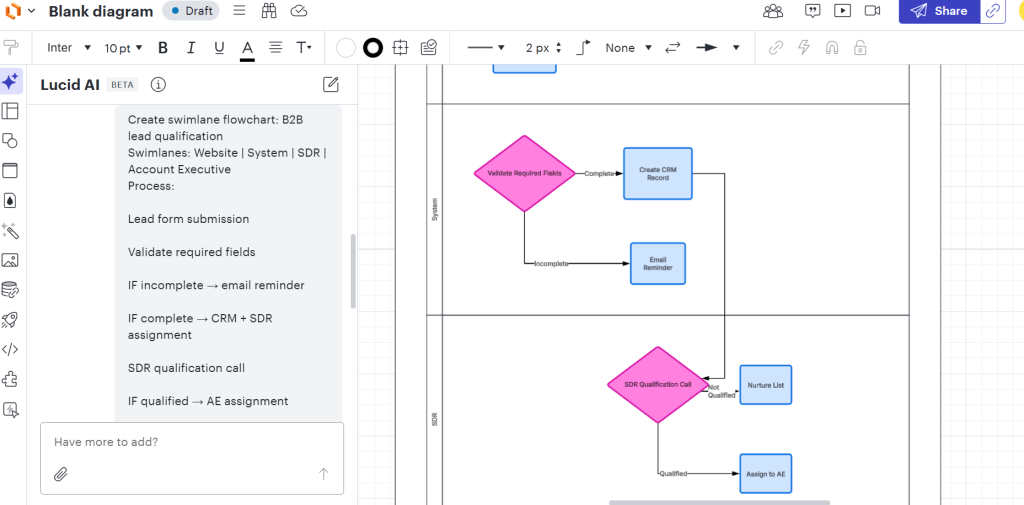
As you can see in the image above, the output is clean, auditable, and presentation-ready. This is where an ai chart generator proves its value in regulated or review-heavy environments.
Miro AI
Team meetings leave you with scattered customer complaints. Miro AI turns those into horizontal journeys showing multiple paths—not a single deep flowchart, but realistic branching outcomes.
Miro AI Prompt:
Create horizontal customer onboarding journey from these complaints, showing 3 realistic paths:
- Signup form too long
- Email expires fast
- Checklist confusing
- No guided tour
- CSM calls too late
Layout: Horizontal timeline (Signup → Verify → First Use → Value → Support)
Paths:
- Happy path (green): Everything works
- Verification fail (orange): Email issues
- Value fail (red): No ‘aha’ moment
Requirements:
- 5 main stages left→right
- 3 parallel paths below the main timeline
- Place complaints as callouts on failing paths
- Thick green arrows (happy path), thin orange/red (drop-offs)
- Wide layout, not deep-fits one screen”
You Clean horizontal map showing where most customers succeed vs fail. No deep nested flows, just realistic branching. The team immediately spots the 20% of paths causing 80% of drop-offs.
Perfect for prioritization discussions: “Should we fix email first, or the missing ‘aha’ moment?”
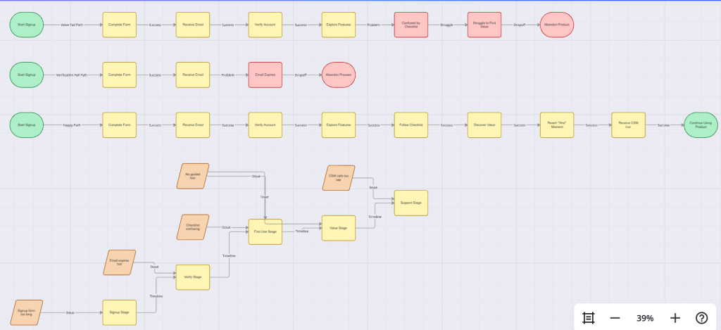
The ai chart generator transforms raw input into a structured journey map in under two minutes.
Whimsical AI
Whimsical is built for speed. No visual clutter. No corporate heaviness. It is the tool teams reach for when something needs to be explained clearly and quickly. The ai chart generator inside Whimsical focuses on structure first and polish second, which makes it ideal for product flows, funnels, and investor slides.
When product teams ask for a signup flow or founders need a funnel slide in minutes, this is where Whimsical excels.
Here’s a sample Whimsical AI Prompt that I tried while testing it:
Simple vertical user flow: Free trial signup
- Visitor clicks ‘Start Free Trial’
- Enter email → Send verification
- Click the verification link
- Complete 3-step checklist
- See paywall after 7 days
Requirements:
- Vertical stack
- Arrows between steps
- Basic decision: ‘Verified?’
- Clean, minimal layout”
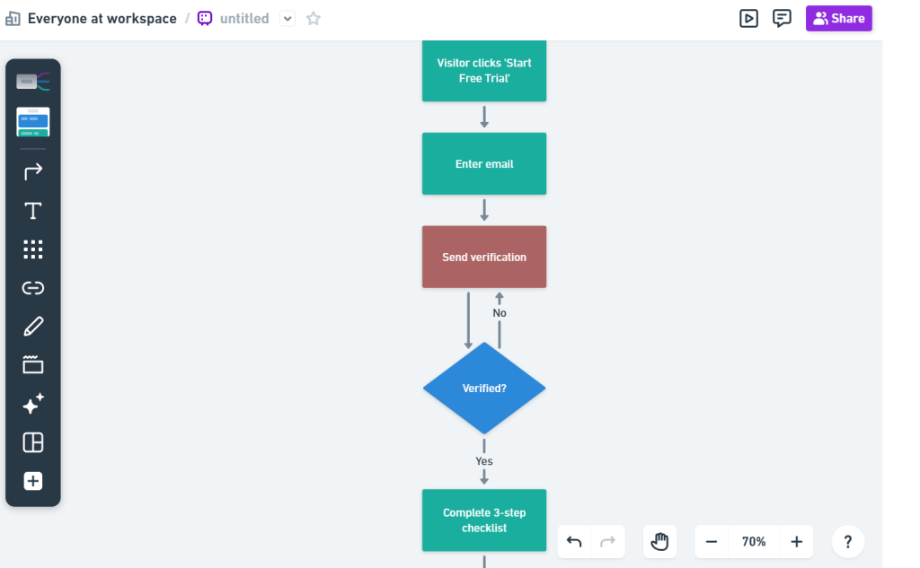
You’ll get a crisp 5-step flow ready for Slack/Deck. Zero ceremony. Add your conversion numbers later. This ai chart generator handles layout so the user can focus on accuracy and numbers.
Eraser DiagramGPT
Explaining data infrastructure to mixed audiences often causes friction. Engineers want accuracy. Business teams want clarity. Eraser sits in the middle. Its ai chart generator understands cloud architecture, analytics pipelines, and system dependencies without forcing users to draw every component manually.
This makes it ideal for analytics stacks, event pipelines, and platform overviews.
Eraser DiagramGPT Prompt:
Ever tried showing “Web app flow” AND “batch processing flow” on one slide without it looking like spaghetti? Eraser DiagramGPT nails this with compact dual-direction layouts that fit anywhere. Horizontal for real-time, vertical for batch – connected exactly how they actually interact.
Eraser asks smart follow-up questions (“Do these flows interact?”) then builds precise connections. Here’s a sample prompt for Eraser that I tried while using this tool.
“Create a small dual-flow diagram WITH interactions:
Horizontal (top): Web → API → DB
Vertical (bottom): App → Queue → Reports
Interactions:
- DB sends data → Queue
- Queue sends summary → Reports
Requirements:
- Compact layout
- 6 boxes total
- Show interaction arrows (DB→Queue)
- Both horizontal + vertical flows visible
- Simple straight arrows”
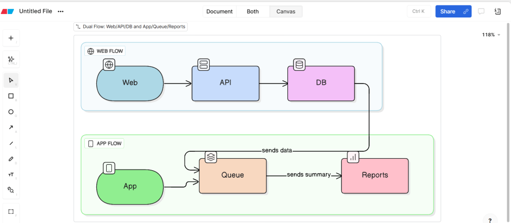
As you can see, this ai chart generator produces a diagram that both engineering and leadership can reference. It reduces misalignment and removes endless redraw cycles.
Mermaid Chart AI
Static diagrams age quickly when documentation changes. Mermaid Chart solves this by generating diagram code that lives alongside text. Its ai chart generator outputs both a visual preview and Mermaid code that renders anywhere Mermaid is supported.
This approach finally allows diagrams to version with documentation.
Mermaid Chart AI Prompt:
“Generate Mermaid flowchart in top-down direction for support ticket escalation process.
Flow:
Customer submits ticket → Tier One Review → Decision Resolved?
Yes → Close ticket and send CSAT survey
No after twenty four hour SLA → Tier Two Review → Decision Resolved?
Yes → Close ticket and send CSAT
No → Engineering Review → Tier Two Follow Up → Customer Closure
Requirements:
- Subgraph swimlanes for Customer, Tier One Support, Tier Two Support, Engineering
- Yellow decision diamonds with Yes and No splits
- Red paths for SLA violations
- Green paths for successful resolution
- Node labels showing ticket status changes
- Readable at eight hundred pixel width for GitHub rendering”
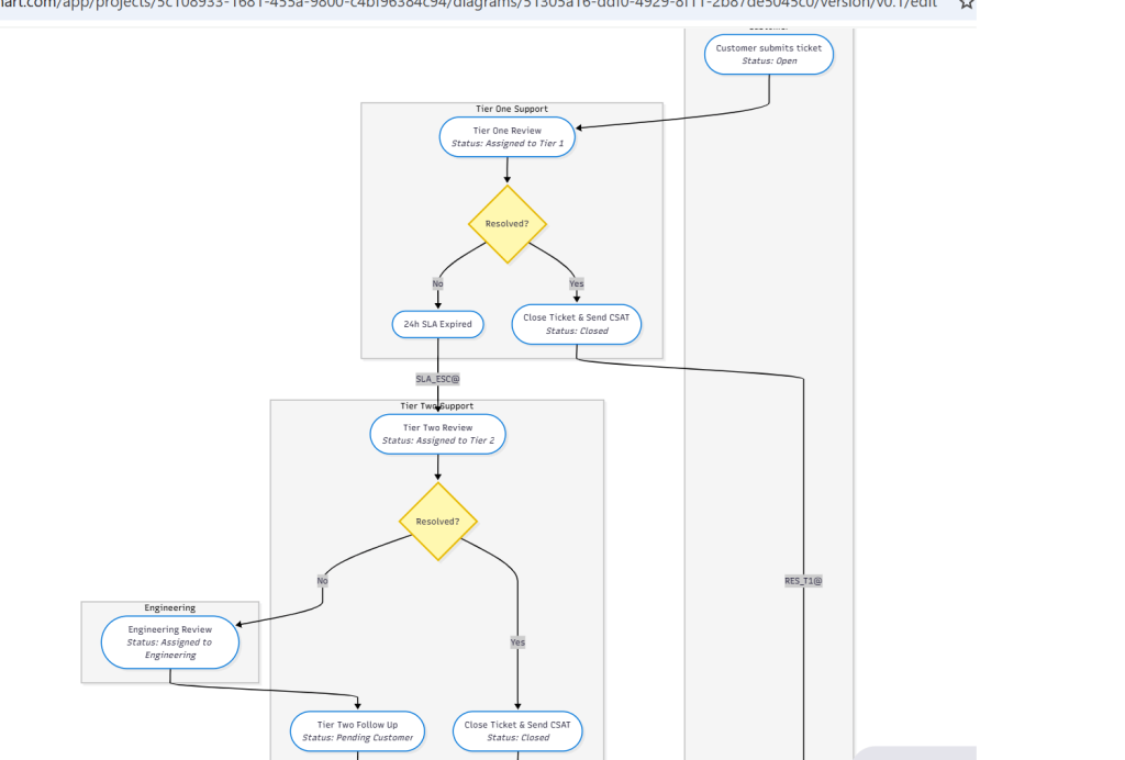
Here, the ai chart generator produces diagrams that update automatically when the text changes. This solves one of the biggest pain points in process documentation.
Napkin: When You Need Story Instead Of Structure
Not every explanation needs a process map. Sales teams often need stories that mirror real customer experiences. Napkin focuses on narrative clarity. Its ai chart generator converts story descriptions into simple six-frame visual sequences.
This works well for sales enablement and internal storytelling.
Napkin Prompt:
“Create a six-frame horizontal storyboard showing Accounting Manager Mary’s journey.
Story sequence:
Mary sees LinkedIn post → Visits pricing page → Reads case study → Starts free trial → Imports messy CSV → Generates first clean report → Books demo → Becomes internal champion.
Requirements:
- Stick figure representation of Mary and the product in each frame
- Maximum eight-word caption per frame
- Emotional progression from curious to hopeful to frustrated to delighted to champion
- Informal napkin sketch style
- Readable on mobile screens for sales sharing”
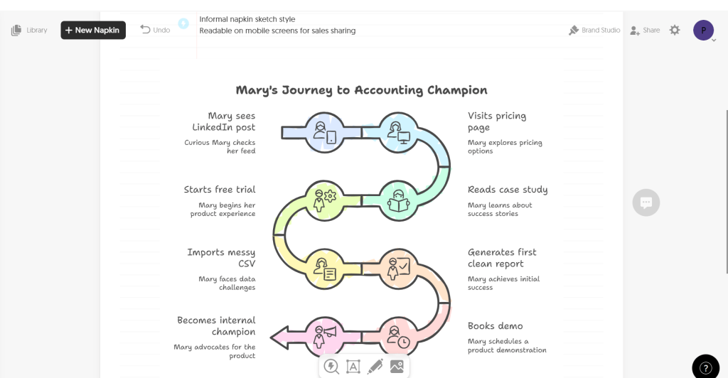
The ai chart generator here prioritizes emotional flow over technical precision. This makes it effective for conversations where relatability matters more than detail.
Why This Stack Works Together?
Each tool serves a distinct purpose, but all rely on the same underlying principle: describe first, render second.
- Lucidchart handles formal and process-heavy workflows.
- Miro supports collaboration and synthesis.
- Whimsical excels at speed and product clarity.
- Eraser bridges technical and business audiences.
- Mermaid supports documentation and version control.
- Napkin delivers narrative clarity for sales and storytelling.
Across all of them, the ai chart generator removes manual friction and accelerates understanding. Teams stop fearing diagram updates and start using visuals again.
Up to this point, the focus has been on explaining how systems work. Structure alone is only half the picture. Teams also need to understand how systems perform—conversion rates, drop-offs, parallel processes, and decision gates.
Direct text-to-diagram tools excel at turning descriptions into visuals. But they hit a wall: what exact words trigger their AI parsers? Vague inputs yield vague diagrams. Precise prompts yield precise diagrams.
That’s where prompt optimization comes in.
Instead of guessing syntax for Lucidchart, Miro, Whimsical, or Eraser, use prompt generator workflows. Describe your process once → get copy-paste-ready prompts optimized for each tool’s AI.
The missing workflow:
text
Your idea → Prompt generator → Tool-specific prompt → Target diagram tool → Perfect diagram
This unlocks reliability across platforms. No more “diagram didn’t render” frustration. Teams focus on strategy, not syntax.
So let’s take a look at the universal AI code generators that can accelerate your diagram and chart creation process.
Universal AI Code Generators
Tool access varies. Sometimes only a phone is available. Sometimes subscriptions block progress. Universal AI models solve this by acting as portable ai chart generator engines. They output executable diagram code that can be rendered anywhere.
This approach guarantees diagram generation without vendor lock-in.
ChatGPT
ChatGPT excels at speed and flexibility. It generates Mermaid, PlantUML, and Graphviz code from plain language. As an ai chart generator, it handles most business flows effortlessly.
ChatGPT Prompt:
You are a Lucidchart/Miro prompt expert. User will describe a business process.
Create 3 separate prompts (one for Lucidchart AI, one for Miro AI, one for Whimsical AI) for this process: B2B customer lifecycle – Marketing (40% conv) → MQL → SDR (50% conv) → SQL → AE (30% conv) → Customer → CS (80% conv) → Activated → Expansion (25% conv) → Renewal (90% conv)
For each tool’s prompt, include:
- Exact flow direction (LR/TB)
- Swimlanes/actors
- Decision points + drop-off %
- Color coding rules (green>40%, yellow 25-40%, red<25%)
- Layout specs (compact, slide-ready 1200px width)
- Tool-specific syntax
Return 3 copy-paste prompts, 150 words max each.
The ai chart generator produces code that renders instantly in mermaid.live or Miro.
Claude
Claude handles formal syntax and parallel logic with high accuracy. When flows involve concurrency, timing, or service interactions, its ai chart generator produces cleaner results.
Claude Prompt:
“Generate tool-specific AI prompts for this multi-step process:
Checkout flow – Customer initiates → Web App → Payment Gateway, then parallel: Order Service updates inventory + Payment confirms, Email sends after both complete
Target tools: Eraser DiagramGPT, Lucidchart Shape Library, Miro flowchart
For EACH tool, create a prompt containing:
- Complete actor list + swimlanes
- Step-by-step sequence with parallel branches
- Success/failure paths
- Timing annotations (<2s per call)
- Tool-specific formatting (sticky notes, hover text, colors)
- Mobile/slide optimization
Return 3 distinct prompts, each under 200 words, ready to copy-paste.”
For engineering-facing documentation, this ai chart generator builds trust through correctness.
Perplexity AI
Perplexity adds a research layer. Before generating diagrams, it reviews best practices from platforms such as HubSpot and Salesforce. The resulting ai chart generator output reflects established standards.
Perplexity Prompt:
“Research industry standards for customer onboarding flows (HubSpot/Salesforce patterns).
Then generate 4 optimized AI prompts for:
- Whimsical Mind Map
- Lucidchart Process
- Miro Workshop Board
- Eraser Dual-Flow
Process: Sign-up → Verify → Checklist → First Value → Activation → CSM Handoff
Each prompt must include:
- Proven industry drop-off rates (32% verify, 28% first value)
- Standard decision gates
- Risk annotations
- Enterprise color/layout standards
- Source citations as comments
Return 4 copy-paste prompts with research backing.”
This approach works well for external-facing deliverables where credibility matters.
Gemini
Gemini integrates well with Google Drive. Its AI chart generator can produce Mermaid diagrams alongside Google Drawings XML, allowing consistent visuals across platforms.
Gemini Prompt:
Create dual-output for this support escalation workflow: Customer → Tier 1 Support → [Decision: Resolved?] → Tier 2 Support → Engineering → Closed (critical path bypasses to Engineering)
- Mermaid code (mermaid.live compatible)
- Eraser DiagramGPT prompt
- Lucidchart AI prompt
Requirements for visual tool prompts:
- Identical logic across both formats
- Google Drive/Slides compatibility
- Decision annotations
- 1200px slide width optimization
Return all 3 deliverables, each copy-paste ready.
This bridges diagram creation with collaborative document workflows.
Multi-Model Strategy
No single model dominates every use case. Teams often combine multiple ai chart generator models:
- ChatGPT for speed and volume
- Claude for technical precision
- Perplexity for researched standards
- Gemini for Google-native workflows
Rendering options remain flexible:
- mermaid.live for instant preview
- GitHub README for auto-rendered documentation
- Notion for embedded diagrams
- Obsidian for local knowledge bases
- Confluence for enterprise documentation
This flexibility ensures diagrams stay accessible everywhere.
How can Teams combine These Tools?
Working in a real-life environment means you need to deal with multiple ai chart generators. You cannot rely on a single one. So here are some workflows that you can use, based on your industry niche and requirements.
Workflow One: Sales Funnel Analysis
- Whimsical generates a funnel structure using ai chart generator logic
- Tableau fills stages with conversion data
- ChatGPT outputs Mermaid code for documentation
- Slack shares diagrams and charts together
Total time stays under ten minutes. The full picture appears instantly.
Workflow Two: Onboarding Deep Dive
- Miro clusters workshop notes into a journey map
- Looker Studio adds cohort conversion data
- Perplexity validates flow against industry standards
- Lucidchart formalizes the final process
The ai chart generator links qualitative insight with quantitative evidence.
Workflow Three: Technical Pipeline Health
- Eraser maps system architecture
- Claude generates sequence diagrams
- Power BI visualizes pipeline KPIs
- Mermaid Chart syncs documentation
Technical clarity and performance visibility align.
The Universal Fallback Pattern
When everything else fails, one pattern always works:
- Describe the process to an ai chart generator
- Generate Mermaid code
- Render in mermaid.live
- Screenshot and share
Four minutes. Zero subscriptions. No friction.
Pro Tips To Use Any AI Chart Generator Effectively
Whatever ai chart generator you are working with, there are some basic rules you must follow. You implement these rules, and your charts will emerge very accurate. Here are some of them.
- Always specify diagram direction, such as left to right or vertical
- Name lanes clearly using roles instead of vague labels
- Call out SLAs explicitly to prevent timeline confusion
- Request decision points so branching appears correctly
- Ask for space for metrics to avoid cramped layouts
- Design for slide readability and mobile viewing
These instructions help any ai chart generator produce cleaner results.
Limitations of An AI Chart Generator In Real Work
An ai chart generator saves time fast, but it also introduces a new type of risk: visual certainty without logical certainty. Clean diagrams look convincing even when the underlying logic is incomplete. Teams that treat AI-generated diagrams as final answers usually run into issues later.
The tool reflects what is written, not what actually happens.
The First Output Is Almost Always Incomplete
The most common mistake is accepting the first diagram an ai chart generator produces. Business processes rarely live fully in documents. Many steps exist as habits, verbal rules, or tribal knowledge. If those details never make it into the prompt, the diagram skips them.
This leads to diagrams that look correct but hide:
- Manual approvals
- Informal escalations
- Timing gaps
- Exception handling
Strong teams treat the first output as a draft and review it like code.
AI Optimizes For Clarity, Not Accuracy
An ai chart generator prefers simplicity. When faced with complexity, it compresses logic to keep diagrams readable. That behavior works for presentations but becomes risky for execution-level documentation.
Processes involving compliance, payments, or customer support often break when AI smooths over edge cases. The fix is direct: explicitly write exceptions and conditional paths. If it is not stated, the AI will assume it does not exist.
Overloading Prompts Reduces Diagram Quality
More text does not mean better diagrams. Large SOP dumps usually result in cluttered visuals. An ai chart generator works best when inputs are modular.
High-performing teams:
- Split large systems into multiple diagrams
- Keep each diagram focused on one question
- Reuse actors and naming consistently
This keeps diagrams readable and maintainable.
AI Diagrams Are Explanations, Not Proof
A diagram generated by an AI chart generator explains intent. It does not prove correctness. Teams still need validation through walkthroughs, testing, and real data.
Using AI diagrams as conversation starters works well. Using them as a final authority usually fails.
When Manual Diagramming Still Makes Sense?
An AI chart generator struggles in early ideation. When relationships are unclear or still forming, manual whiteboarding remains better. AI performs best after thinking stabilizes.
The pattern that works:
- Think manually
- Describe clearly
- Generate visually
- Refine iteratively
Skipping the thinking step leads to premature structure.
Where AI Consistently Wins
Despite limits, an AI chart generator excels at:
- Regenerating updated diagrams quickly
- Keeping visuals consistent across teams
- Syncing diagrams with documentation
- Removing layout and alignment work
These wins compound over time and remove the friction that kills diagram usage.
Wrapping Up
The biggest advantage of an AI chart generator is reversibility. When diagrams are easy to regenerate, you stop avoiding updates. That alone keeps visuals closer to reality.
Manual diagrams resist change. AI diagrams invite it. That difference matters more than speed.
I hope this blog has offered you a great insight into the topic. Remember, AI is here to assist humans, not replace them. So it will need some amount of input and a regular intervention from your end to make sure the results are accurate. And I hope this blog helps you with that.
If you liked this blog, feel free to explore my other blogs too. You will enjoy reading and learning.
Till then, happy business chart generations!
FAQs
Is an AI chart generator actually faster than drawing manually?
Yes. It removes layout, alignment, and redraw work. The time goes into reviewing logic, not fixing boxes.
Do AI chart generators understand real business processes?
Only what you describe; if a step or exception is missing in the input, it will be missing in the diagram.
Can I trust the first diagram it generates?
No. Treat the first output as a draft. Review it like you would review code or an SOP.
What breaks most often when using an AI chart generator?
Hidden edge cases, informal handoffs, and timing rules that were never written down.
Is this useful for engineers or only business teams?
Both. Business teams use it for flows and journeys. Engineers use it for pipelines, sequences, and system interactions.
When should I skip using an AI chart generator?
During early brainstorming or fuzzy thinking. It works best after the logic is already clear.
Read more from Technology
- How Agentic AI Integrates APIs, Tools, and Data for Real-World Execution?
- What Are Mermaid Diagrams and Why People Use Them
- My Go-To AI Chart Generator Stack to Create Business Charts in Minutes
- Top Ways AI Is Changing Software Development and Product Management
- The Hidden Cost of Network Blind Spots & How ITOM Software Can Fix It?
- Why SIEM tools Lead Compliance in 2025?
- Why Enterprises Want the Best IT Service Desk to Monitor Employee Experience?
- Why Remote Device Threats Are a New IT Headache?
- How to choose the best procure-to-pay software for your business?
